CUPRA Website Revamp: A Sleek Redesign
Elevating the Online Presence of a Premium Car Brand
The challenge
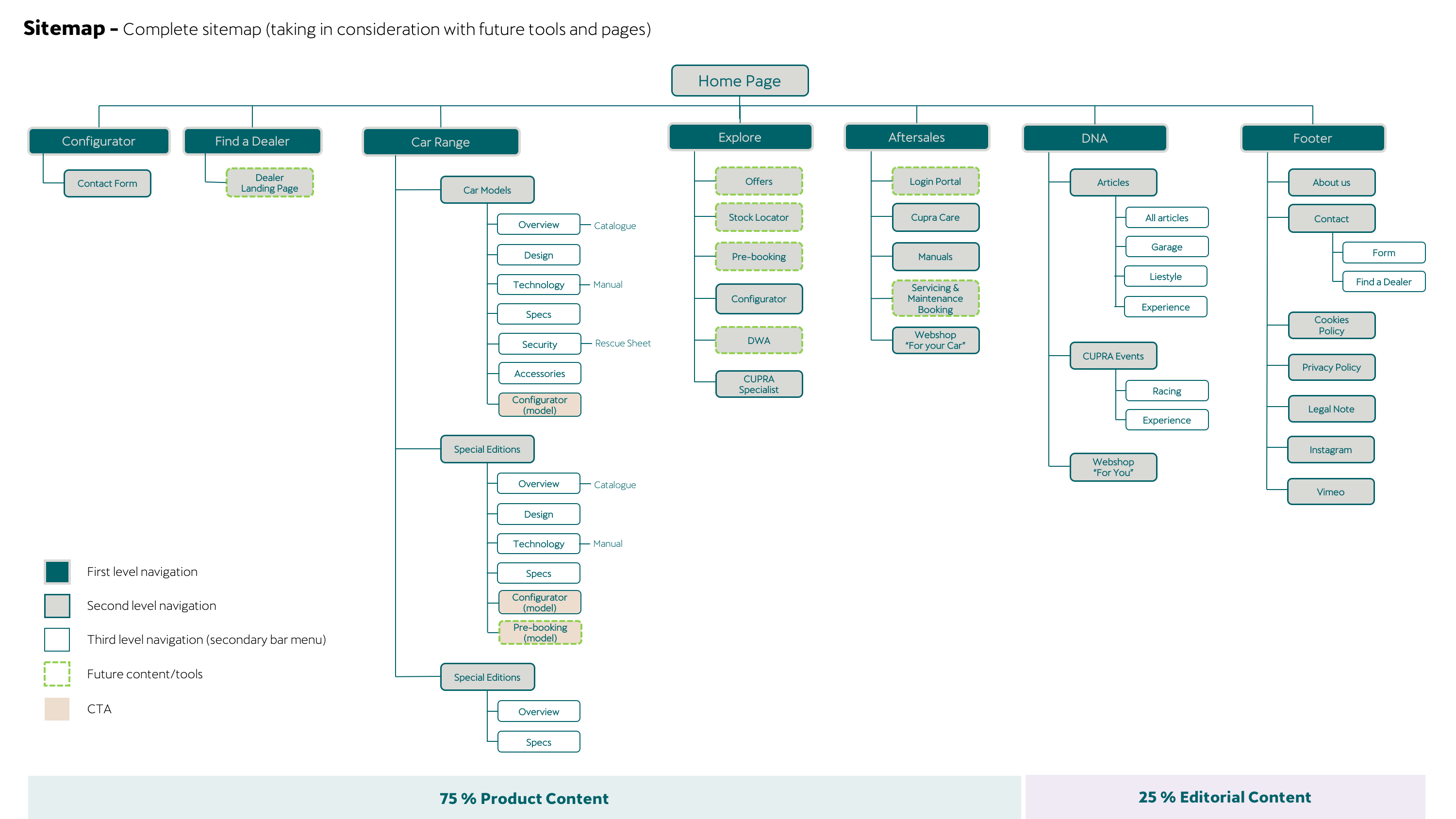
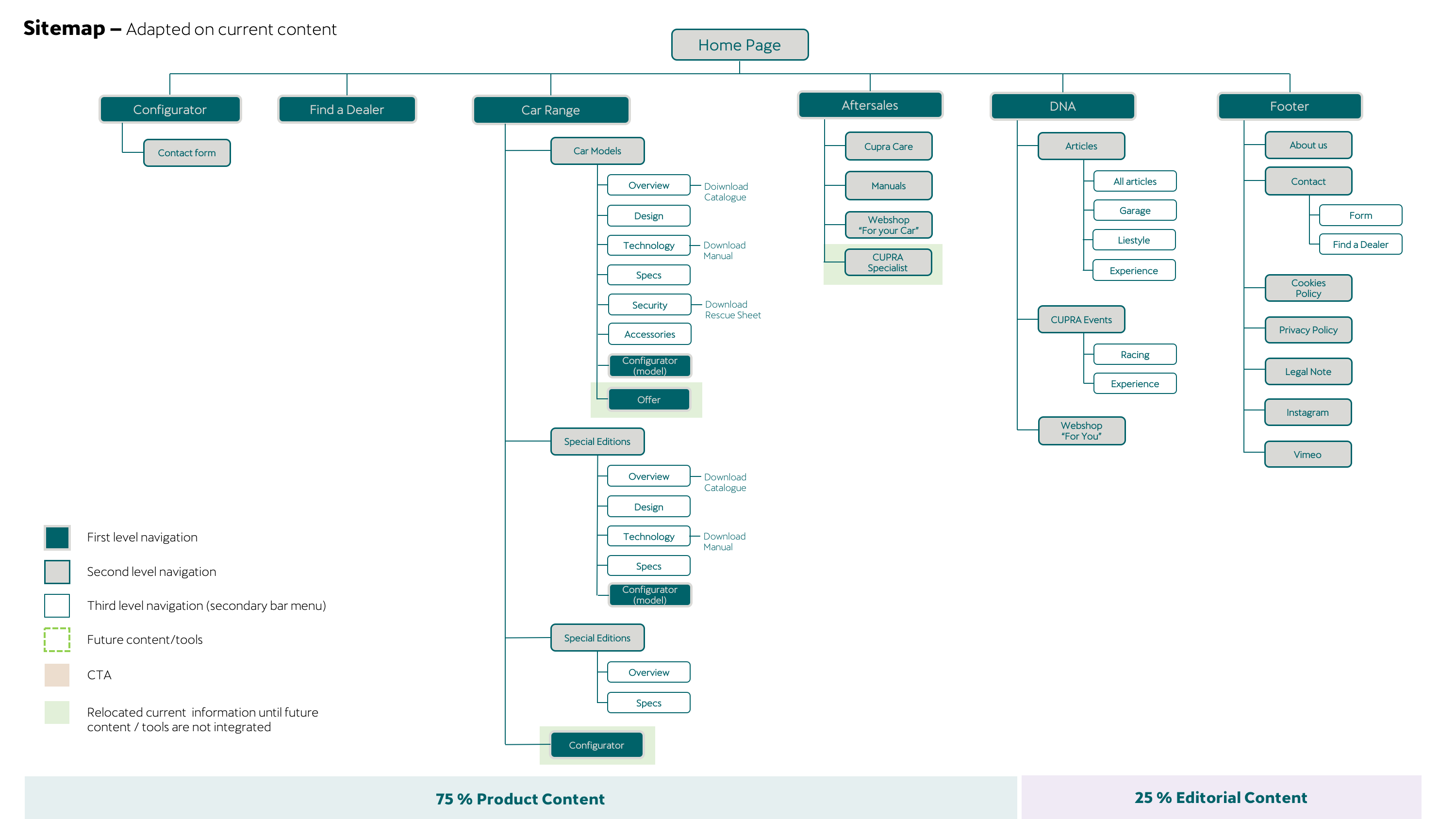
The challenge in this project involved a two-fold approach. First, it required a complete redesign of the website's underlying structure while preserving its existing logic and accommodating future content updates. Secondly, the task was to maintain the brand's established Corporate Identity (CI) while introducing new design elements that aligned with its unique style. Balancing these objectives was key to ensuring the redesigned website remained both faithful to the brand's heritage and relevant in a contemporary context.
ROLE
UX/UI Designer
CLIENT
CUPRA (SEAT)
PLATFORM
PLATFORM
Website
TOOLS
Sketch, Flinto, Principle, Zeplin
METHODS
Data research, Map affinity, Card sorting, Tree testing
DURATION
6 months
Objectives
The main objective of this project was to increase user interaction with the CUPRA website. Besides, the following three objectives were raised specifics:
- Improve understanding of CUPRA content.
- Give more importance to the product.
- Allow countries to customize more the content and be able to update it more frequently.
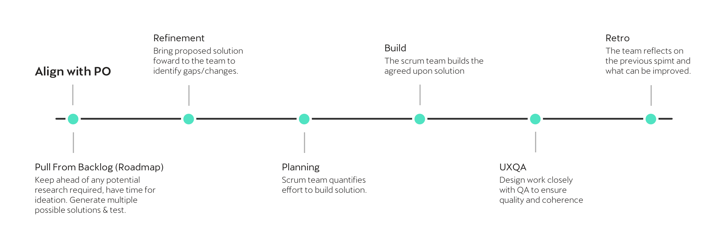
Methodology
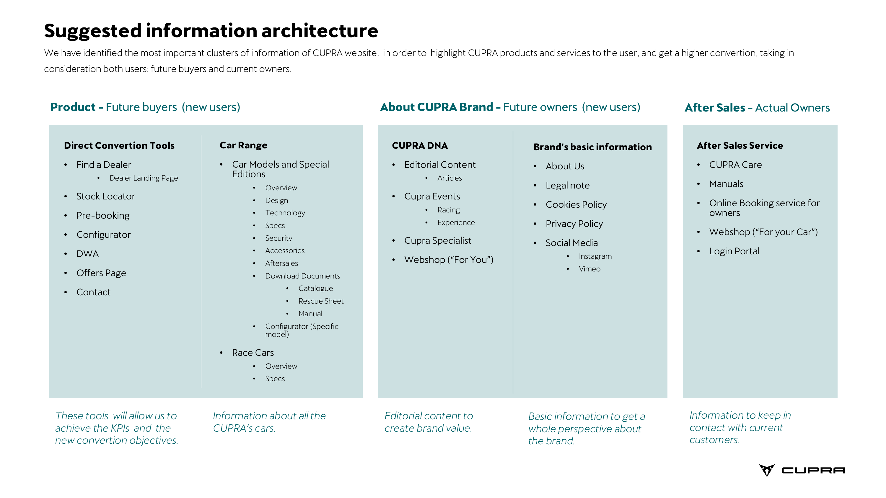
We decided to make a linear process, analyzing at the beginning of the CUPRA information cluster.
Then, through an affinity map, we were prioritizing which content was most relevant for users.
Then we started the process of redesigning the sitemap of the web and to better understand our users we made a card sorting.
Subsequently, to verify that this new navigation worked, we performed a tree testing.
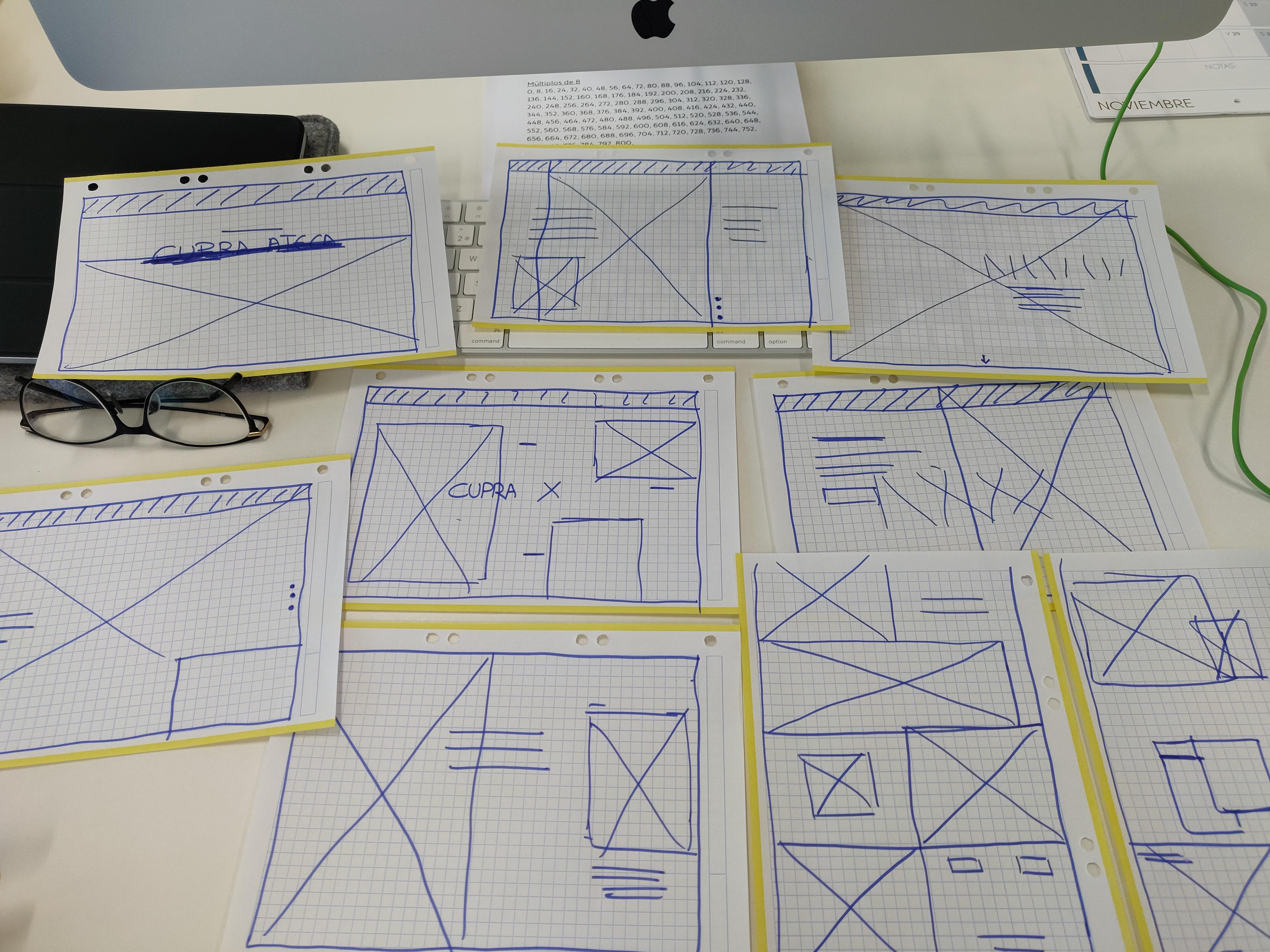
Once the skeleton of the web had been clarified, we started to make wireframes for the new homepage.
UX Research
Wireframing
As a result of a deadline change, we had to quickly move from low fidelity wireframes to direct design.
We made a first proposal with a more CUPRA style, more elegant, magazine, exclusive brand.
In this proposal we tried to include all the current content of the homepage, but adding more product. Because is the new approach that they wanted to have.
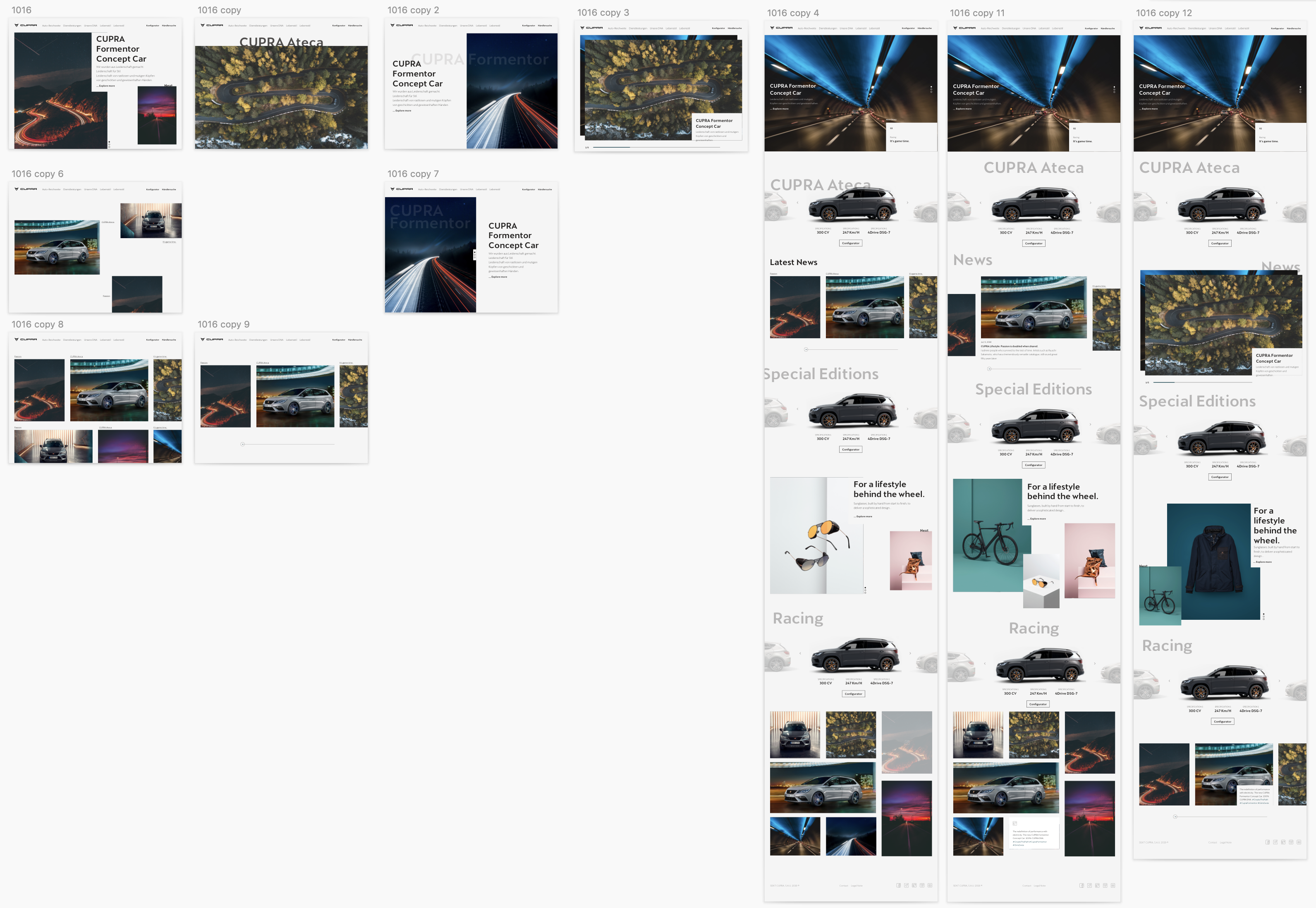
This is the prototype of this first proposal:
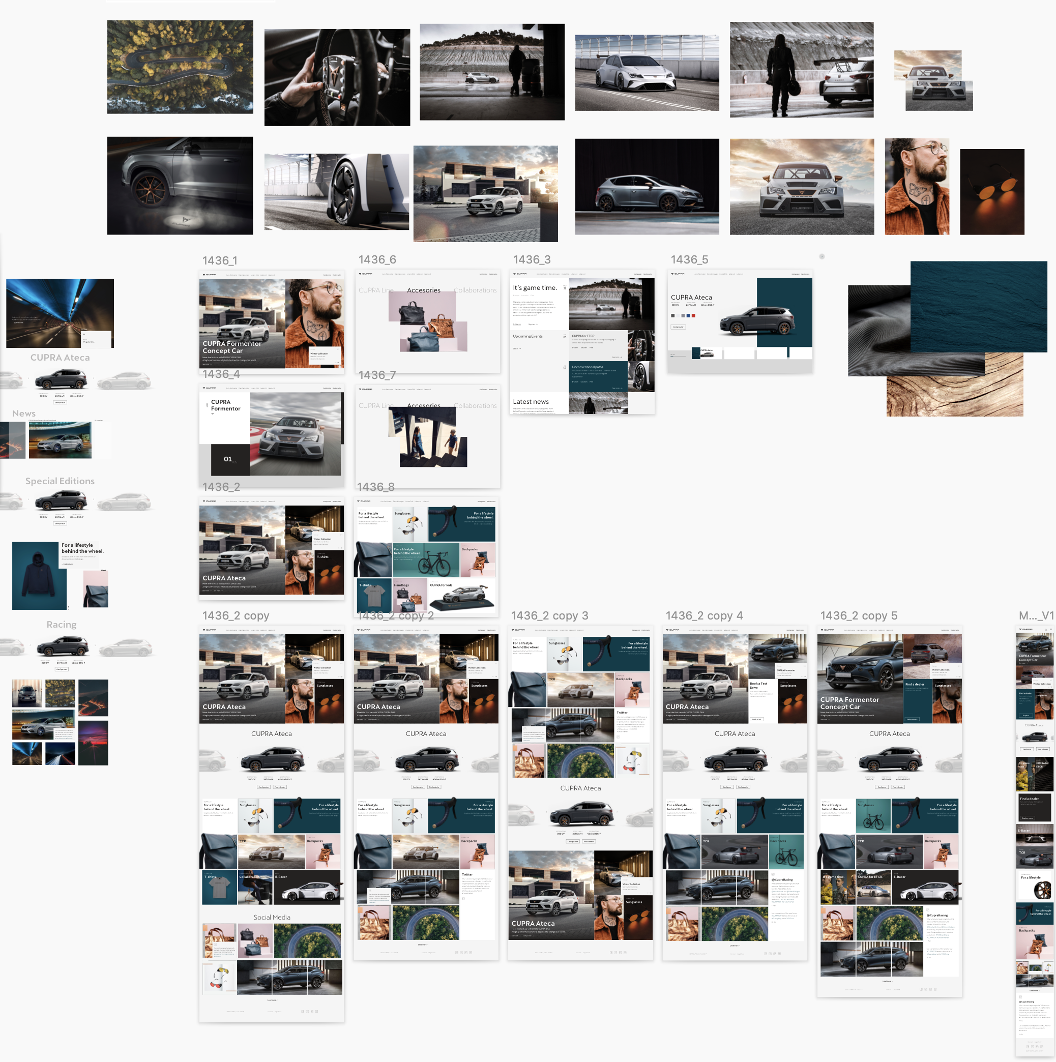
After having a meeting with stakeholders, we try to take their feedback into account and make a new proposal.
In this proposal we worked to have more diverse content, in order to give countries the option of customizing the website.
Final design
You can visit now the website live in all the countries: CUPRA Website
©Beatriz Gómez Pérez. All rights reserved.
©Beatriz Gómez Pérez. All rights reserved.
©Beatriz Gómez Pérez. All rights reserved.
